In the digital age, your contact page serves as a pivotal touchpoint between your business and potential customers. An optimized contact page not only facilitates communication but also significantly boosts conversions. This article explores comprehensive strategies to enhance your contact page, ensuring it’s compelling, user-friendly, and effective at converting visitors into leads or customers.

The top part of your webpage, known as 'above the fold,' is where visitors’ attention is naturally drawn first. This space is crucial for communicating what your business offers and why visitors should care. A clear, compelling value proposition immediately sets expectations and encourages users to stay engaged.
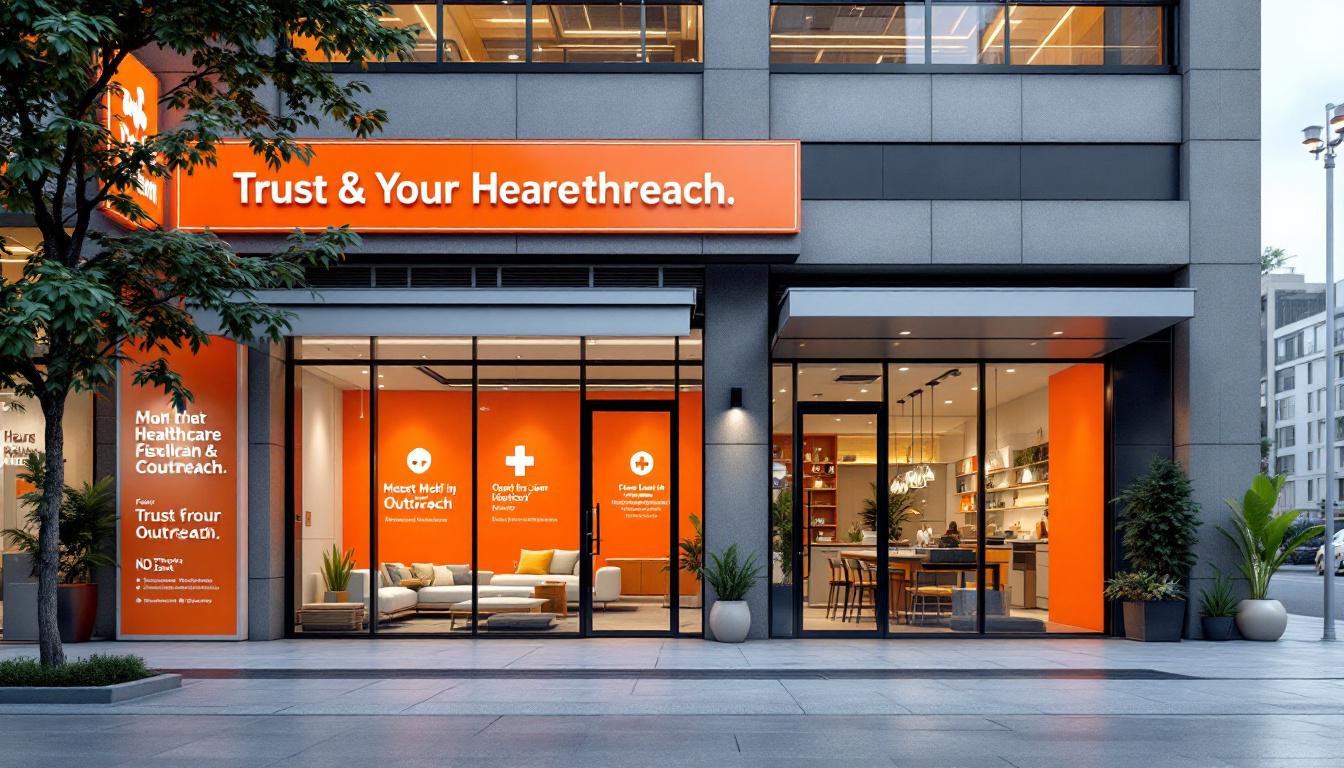
Positioning your main message prominently involves using bold headlines and supporting visuals that instantly convey benefits or solutions. Your headline should be specific and benefit-oriented, capturing attention within seconds. Complement this with visuals—like images of people enjoying your product or service—that reinforce your message.
Attention-grabbing headlines and strong visuals work together to tell your story quickly. Using contrasting colors for calls-to-action (CTAs) makes them stand out, prompting users to take the next step. Incorporating simple, clean layouts with plenty of whitespace ensures the message isn't lost in clutter. This clarity helps guide visitors toward converting—whether that’s filling out a form, making a call, or exploring more about your offerings.
By focusing on a well-crafted above-the-fold section, you immediately communicate value, reducing bounce rates and increasing the chance of visitors moving further into your site. When your headline and visuals are aligned and attention-grabbing, users develop trust and understanding quickly, which encourages more engagement and higher conversion rates.
Below is a summary table illustrating how various elements contribute to an effective above-the-fold experience:
Element Purpose Impact Best Practice Examples Clear headline Communicates main benefit Increased engagement Use benefit-driven language like "Get Your Free Guide" or "Save Time Today" Visuals Capture attention, convey value Builds emotional connection Use images of happy customers or product showcases Contrast colors Draws attention to CTAs Higher click-through rates Bright, contrasting buttons like orange or green Layout simplicity Guides focus Reduced confusion Minimal clutter, balanced whitespace Key messages positioning Sets expectations immediately Higher user retention Place core message in the top third, with supporting visuals nearby
In summary, designing your above-the-fold section with clarity, visual appeal, and strategic placement significantly enhances initial user trust and engagement. When visitors instantly grasp what you offer and see a clear path for action, your overall conversion rates improve.
Enhancing contact form usability starts with simplicity. Keep your forms short and focused by including only essential fields such as name, email, and phone number. Use a single-column layout, which is easier to scan and complete, especially on mobile devices.
Logical grouping of related fields reduces cognitive load and guides users smoothly through the process. Incorporate clear, descriptive labels paired with inline validation and real-time error messages to immediately inform users of mistakes, reducing frustration.
Replace placeholder text with floating labels for better clarity and accessibility. Distinguish required fields visually with asterisks or contrasting colors, and clearly indicate optional fields.
Make your forms mobile-friendly by resizing input fields, enlarging tap targets, and supporting optimized input types like email or telephone. Visual feedback, such as checkmarks or highlighting, helps users feel confident in their submissions.
Reassure visitors by displaying privacy policies and security badges, and confirm successful submissions with immediate thank you messages. An ongoing process of testing and optimization across various devices and user scenarios ensures a seamless, trustworthy experience.
Placement of your contact form plays a vital role in user engagement. Position forms prominently, ideally above the fold or at natural stopping points in your content, such as the end of an informative section.
Keep the form design minimal—limit fields to no more than five—and ensure straightforward labels like "Get a Quote" or "Sign Up Now" that clearly articulate the action.
Optimize form layout for mobile usage by designing large tap targets, using clear fonts, and employing single-column arrangements.
Reduce friction by hiding non-essential fields unless absolutely necessary, and employ conditional logic to show relevant questions based on user responses.
Use compelling call-to-action (CTA) buttons in contrasting colors to make them stand out. For example, a bright red or green button with action-oriented text encourages clicks.
Testing different placements, designs, and field combinations via A/B testing can reveal what resonates most with your audience. Continually refine your approach based on analytics and user feedback.
Aspect Best Practice Purpose Form Length Limit to 4-5 fields Decreases friction, increases completion rates Placement Above the fold, at natural stopping points Maximize visibility and relevance Mobile Optimization Large tap targets, single-column layouts Improve usability across devices Visual Cues Clear labels, arrows, icons Guide users intuitively Validation Inline, real-time validation Reduce errors, improve user confidence call-to-action (CTA) Contrasting colors, action-oriented text Increase click-throughs Privacy & Security Display badges, trust signals Boost trust and reduce hesitation
Continuous monitoring and iterative testing—such as A/B tests on form fields, placement, and CTA design—are crucial to refine the contact experience further. By focusing on clarity, simplicity, and accessibility, businesses can significantly improve user engagement and conversion rates.
A/B testing involves creating variations of a contact page—such as different headlines, form fields, button colors, or placement—and comparing their effectiveness. By analyzing user interactions, organizations can identify which version encourages more inquiries or conversions. For example, testing a prominent, action-oriented headline against a more subtle one can reveal what resonates best with visitors.
Analytics tools provide valuable insights by highlighting where users drop off in the process or which areas attract the most attention. Understanding these patterns helps prioritize improvements, such as repositioning forms, removing distractions, or adjusting visual hierarchy.
Continuous iteration—like refining mobile layouts separately—ensures that each change is backed by data, leading to incremental and measurable performance enhancements.
Involving diverse teams, from design to marketing, and documenting outcomes encourages a culture that relies on evidence rather than assumptions, ultimately driving sustainable growth.
Reducing obstacles in the inquiry process is vital for increasing engagement. Simplifying contact forms by limiting fields to essential information—such as name, email, and message—reduces abandonment, especially on mobile devices.
Offering multiple channels, including live chat, quick-access support buttons, or direct phone numbers, allows users to choose their preferred method of contact, making the process seamless.
Automated systems like chatbots and support portals provide instant assistance and answers to common questions, decreasing the workload on human agents and speeding up responses.
Pre-qualifying inquiries through intelligent call routing ensures that users are connected to relevant support personnel quickly, preventing frustration.
Additionally, maintaining transparency with clear privacy policies, security badges, and real-time validation messages builds trust and encourages users to initiate contact.
Implementing these tactics creates a frictionless experience, making it easier for visitors to reach out and increasing the likelihood of conversions.
Element Effect on Conversion Best Practices Headline Attracts attention Use benefits-driven copy, highlight solutions Placement of forms Affects visibility Place above the fold or near engaging content Call-to-action buttons Drive clicks Use contrasting colors, action-oriented phrases, and urgency cues Form fields Impact ease of completion Limit to 3-5 fields, use single-column layout, enable autofill Visual cues (icons, arrows) Guide user focus Use clear, intuitive icons and directional cues Mobile responsiveness Improves user experience Ensure buttons are large; test across devices Trust signals (badges, policies) Build confidence Display security badges, privacy notices, and testimonials
Data collection tools like heatmaps, analytics, and user feedback surveys are essential. Heatmaps visually show where users click or scroll, revealing which parts of the page attract or lose attention.
User comments and feedback forms offer direct insights into pain points and preferences, guiding targeted adjustments.
Regularly conducting A/B tests on various elements—such as layout, copy, and form design—helps pinpoint what works best.
Analyzing this data over time allows marketers and designers to refine the user experience systematically.
Creating separate forms based on visitor intent or demographic segments can personalize responses, further increasing engagement.
Long-term initiatives like nurturing leads via email, refining 'thank you' pages with additional offers, and building community through social media sustain progress.
By continuously testing, analyzing, and adapting, organizations can achieve higher conversion rates and improved customer satisfaction.
Enhancing contact page conversion rates involves multiple tactics focused on building trust and reducing barriers for users. One of the most effective approaches is showcasing social proof, such as testimonials, case studies, and logos of satisfied clients. These elements reassure visitors about your credibility and reliability.
Creating a sense of urgency can also significantly motivate immediate action. Limited-time offers, exclusive discounts, or FOMO (Fear of Missing Out) triggers prompt users to reach out sooner rather than later.
Optimizing the contact form itself is crucial. Keeping the number of form fields to five or fewer minimizes friction, particularly important for mobile users who prefer quick, straightforward interactions. Using conditional logic to show only relevant questions streamlines the process further.
Form placement impacts visibility—placing forms above the fold or near engaging content increases the chances of user interaction. Using contrasting colors for CTAs helps them stand out, and clear, action-oriented language encourages clicks.
Regular testing, like A/B testing form elements or layout, combined with analyzing user behavior through heatmaps, enables continuous improvement tailored to your audience.
As mobile device usage continues to rise, ensuring your contact pages are mobile-friendly is more important than ever. Responsive design ensures your page adapts smoothly to various screen sizes, providing a seamless experience for all users.
Best practices include making key information—such as contact details—immediately visible and easy to access. Large, touch-friendly CTAs with ample spacing prevent accidental clicks.
Minimizing load times by compressing images and reducing unnecessary scripts helps keep pages swift, reducing bounce rates.
Content should be concise, with straightforward language, guiding users efficiently toward action. Features like click-to-call buttons, embedded maps, and simple, mobile-optimized forms facilitate interaction.
Finally, incorporating local SEO elements like displaying your address clearly and ensuring your contact page is easy to find in search results boosts visibility and trust.
Strategy Purpose Additional Details Showcase social proof Build trust and credibility Testimonials, case studies, client logos Create urgency Encourage immediate contact Limited-time offers, countdown timers Limit form complexity Reduce barriers to completion No more than five fields; use conditional logic Strategic form placement Maximize visibility Above the fold, near engaging content Optimize for mobile Facilitate easy interaction Responsive design, touch-friendly buttons Use contrasting CTA colors Attract attention and increase clicks Bright, noticeable buttons Regular testing and analysis Improve over time A/B testing, heatmaps
Employing these strategies creates a seamless, trustworthy, and action-oriented experience that enhances user engagement and conversion chances.
Optimizing contact pages involves several essential tactics. First, present a compelling value proposition clearly above the fold to immediately communicate the benefits and motivate visitors. Pair this with eye-catching calls to action (CTAs) that use action-oriented language and contrast sharply with the background, such as in vibrant red or green.
Keeping the design minimal and focused ensures visitors aren’t distracted. Simplify the form by limiting fields to essential information—preferably no more than five—and position it prominently, ideally above the fold, or near engaging content to facilitate quick contact.
Building trust is vital. Incorporate elements like customer reviews, testimonials, security badges, and professional visuals such as photos of people and products. Fast load times and mobile responsiveness further enhance user experience, reducing bounce rates.
Matching message across ads and landing pages increases credibility, while techniques like exit-intent popups and personalized content tap into visitor intent and foster urgency. Clear post-submission messages or thank you pages reinforce engagement and prompt further action.
Using social proof and trust indicators reassures visitors about safety, especially during transactions. Creating urgency with limited-time offers or FOMO strategies encourages immediate responses, boosting conversions overall.
Regular testing—A/B testing different elements like CTA phrases, form placement, and design—allows continuous refinement, leading to better results over time.
Designing user-friendly contact forms requires thoughtful placement and clear structure. Position forms near relevant content, such as at the top of the page or after key information, ensuring they’re immediately visible—above the fold or in natural reading points.
Keep forms short and straightforward. Limit fields to essential information like name, email, and phone number—no more than five—to reduce effort and avoid user frustration. Use single-column layouts, which are easier on mobile screens, and ensure input fields are large enough for easy tapping.
Use plain, descriptive labels with actionable words like "Get My Quote" or "Request a Callback". Inline validation helps users correct mistakes instantly, minimizing frustration. Incorporate visual cues such as icons or arrows guiding users through the process.
Mobile optimization is critical; design with large tap targets, proper input types, and clear buttons for smartphones. To further reduce friction, avoid unnecessary elements and distractions, focusing the attention solely on the form.
Testing different placements, colors, and field arrangements, while employing A/B testing, uncovers the most effective configurations. This ongoing process ensures the form continues to perform well and adapts to changing user preferences.
A high-converting contact page should feature consistent branding and trust signals, such as logos, testimonials, and security badges, immediately establishing credibility. The headline should be engaging, emphasizing benefits or solutions offered.
Design should be clean and minimalist, removing clutter and emphasizing the essential information through visual hierarchy. Use whitespace judiciously to guide users' eyes toward important elements—like the contact form and CTA.
Fast load speeds are non-negotiable; optimize images and scripts to ensure quick access across devices. The page must be fully responsive, providing an excellent experience whether accessed via desktop or mobile.
The layout should follow a logical flow—starting with the value proposition, followed by supporting elements like social proof, and culminating in the form with a strong CTA. Consistent and contrasting colors for buttons help them stand out.
Including social proof reinforces credibility, while microcopy near form fields can reduce user uncertainty. Use signals of security and privacy policies to reassure users while filling out their information.
Finally, continuously monitor analytics and perform iterative tests to refine the layout, content, and form placement, dramatically improving conversion effectiveness over time.
Optimizing contact pages for better conversions starts with clarity in content and simplicity in layout. Use straightforward language that clearly explains how visitors can contact you, your support hours, and response times. This transparency builds trust and makes it easy for users to understand their next step.
Design a clean, logical layout: typically a two-column structure where contact information is prominently displayed helps visitors locate key details quickly. Placing contact options—like phone numbers, email addresses, and social media links—in headers or footers ensures they are always accessible.
Incorporate minimalistic, mobile-friendly forms with essential fields such as name, email, and phone number, while avoiding unnecessary inputs. Use prominent calls-to-action (CTAs) with action-oriented labels like 'Get in Touch' or 'Request a Callback' to guide users.
Additional details such as business hours, location maps, and response guarantees increase confidence.
Eliminate distracting elements like unnecessary navigation menus or footer links on the contact page. Customizing content for different target audiences and adding frequently asked questions (FAQs) or social proof can reduce hesitation and encourage inquiries.
Combining these layout and content enhancements results in a user-friendly contact page that caters to visitor needs and improves overall conversion rates.
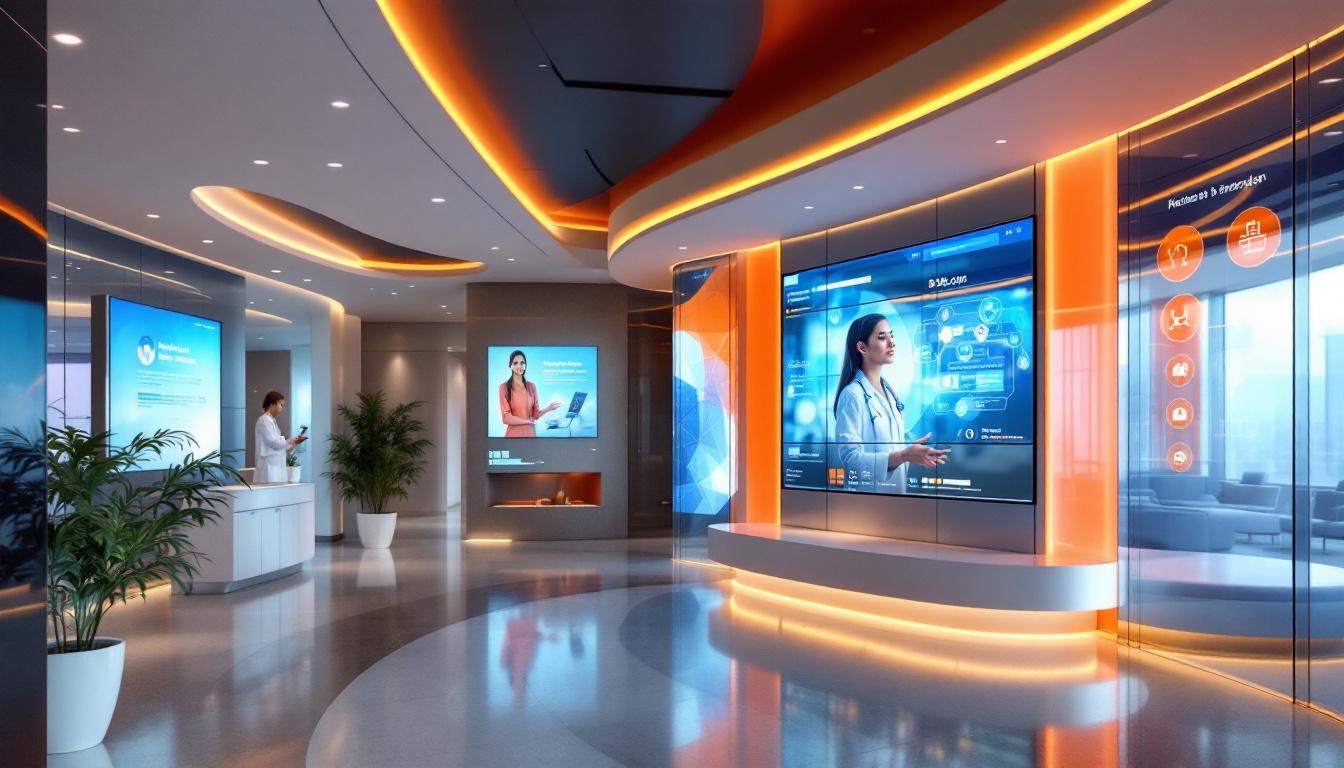
Visual elements play a major role in capturing attention and conveying professionalism. High-quality images of people, your team, or your products make the contact page more engaging and trustworthy. Abstract designs or brand-aligned graphics can reinforce brand identity and create a memorable impression.
Strategically placed social proof such as customer testimonials, case studies, and positive social media mentions can significantly boost credibility. When visitors see evidence of satisfied clients or awards, they feel reassured about reaching out.
Display logos of prominent clients or affiliations to further enhance trust. Incorporating visuals that relate to your messaging not only make the page appealing but also reduce user resistance.
Combined, strong visuals and social proof foster an emotional connection, diminish uncertainty, and motivate users to submit inquiries, leading to more conversions.
Achieving steady growth in contact conversions requires more than just optimizing individual pages; it demands a comprehensive long-term approach. One effective tactic is to enhance the 'thank you' pages with additional offers or content. For example, after a user submits a contact form, presenting related resources, discounts, or exclusive access encourages further engagement and builds trust.
Building a consistent pipeline of traffic is essential. This can be accomplished through strategic content marketing—such as regular blog posts, videos, and social media activity—and forming partnerships with complementary brands or influencers. These efforts attract targeted audiences who are more likely to convert.
Nurturing leads over time transforms initial inquiries into loyal customers. Personalized email campaigns tailored to the visitor’s interests or behaviors keep your brand top-of-mind. Creating a community, whether through social groups or forums, fosters ongoing engagement, providing a space for potential customers to interact and seek support.
Retargeting campaigns are vital for re-engaging visitors who showed interest but did not convert initially. Exit-intent popups, remarketing ads, and personalized follow-up emails serve as gentle reminders and offer incentives to revisit your site.
Continually analyzing user data and collecting feedback helps refine messaging, improve user experience, and identify new opportunities for engagement. Regularly testing different strategies, content types, and offers ensures your approach remains effective.
Effective contact page optimization revolves around clarity, trust, and ease of use. The primary step is communicating your value proposition clearly above the fold, immediately showing visitors what they will gain.
Attention-grabbing calls to action, with action-oriented language and contrasting colors—like red or green—draw focus to the submission button. Keeping the contact form simple by limiting fields to essential information (name, email, and phone number) reduces friction, especially on mobile devices.
Design matters; a clutter-free layout with a clear visual hierarchy directs attention toward the form and CTA. Incorporating social proof, such as testimonials or trust badges, reassures visitors about the credibility of your business.
Speed is crucial—fast-loading pages with responsive design tailored for mobile use maintain user engagement. Consistency in messaging across ads, landing pages, and contact forms—known as message match—builds trust.
Using visual cues like icons and arrows can guide users intuitively through the process. Additionally, testing different placements, button texts, and form configurations via A/B testing helps optimize conversions further.
Lastly, remove distractions like navigation menus or footer links from contact pages, and consider adding incentive offers or guarantees to motivate submissions.
Optimizing your contact page involves a multifaceted approach that centers on user experience, trust-building, and strategic testing. Clear messaging, minimalist design, fast load times, mobile responsiveness, and compelling CTAs are fundamental. Incorporating social proof and creating a sense of urgency can significantly increase visitor engagement. Regular analysis through A/B testing and analytics helps refine the approach continuously, ensuring your contact page remains effective. Prioritizing these elements will yield higher conversions, helping your business grow and thrive in a competitive digital landscape.